Statistical Process Control (SPC)

Being able to accurately record and evaluate data across your personal QI project or across your entire organisation resulting in better, data-driven decision-making, could be the difference between you achieving your objectives or falling at the first hurdle.
In this cheatsheet you can find more about SPC charts and we give you a helping hand to always choose the most suitable chart to measure your improvement work.
Get Your Free Guide
What's inside
Learn how to use SPC charts to determine if an improvement is actually improving a process and also how to use them to ‘predict’ statistically whether a process is ‘capable’ of meeting a target.

|
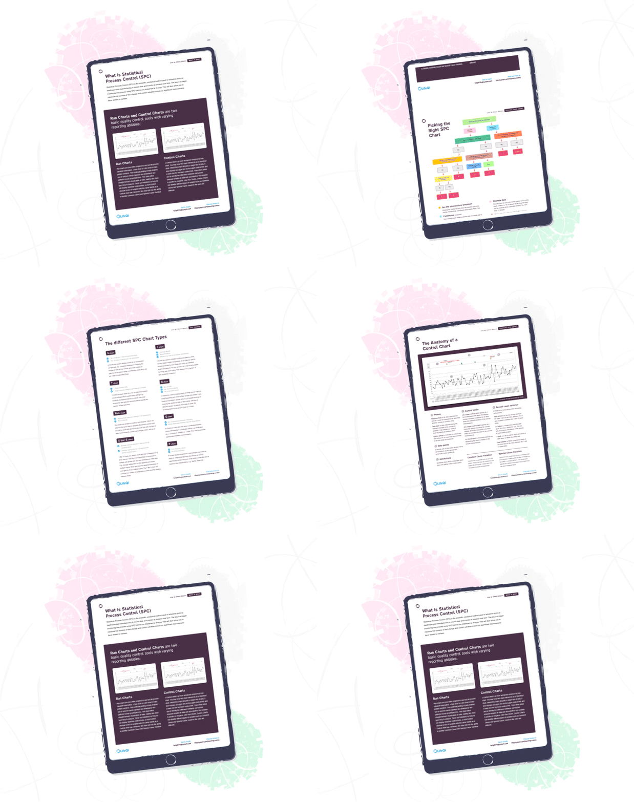
What is Statistical Process ControlUnderstanding Statistical Process Control is key to begin to track and monitor your improvement. We also introduce the two basic quality control tools - run charts and control charts. |

|
Picking the right SPC chartA common problem with SPC Charts is knowing the right one to pick! To ensure you select the best possible chart for your data, we have created an infographic guiding you through the decision-making process. |

|
The different SPC chart typesWe explain the different SPC charts and when to use them through real-life examples. |

|
The anatomy of a control chartWe present control charts in detail for those who are unsure of how an SPC chart breaks down and want to learn the meaning of the related terminology. |

