C Chart

Picture of Kerrie Preston

Published on 9 August 2018 at 14:57

by Kerrie Preston

C chart
 
  • C Charts are used to display counts of things we are trying to avoid happening, (e.g. number of violence incidents, number of falls, number of pressure ulcers) where a fixed sample size exists.
  • It is helpful to note at this point that often we have an inconsistent sample or "area of opportunity" for things we are working on. For example, a hospital working on reducing the number of falls on their wards, will have different number of patients from week to week so their sample size will vary considerably. For a situation similar to this we recommend using a Percentage Chart (P Chart) or Rate Chart (U Chart).
Typical Examples would be:
  •  Number of falls
  • Number of violent incidents
  • Number of pressure sores


C Chart Example

Here we will show you what data is required when creating a C-Chart and how this is reflected in the chart itself. 


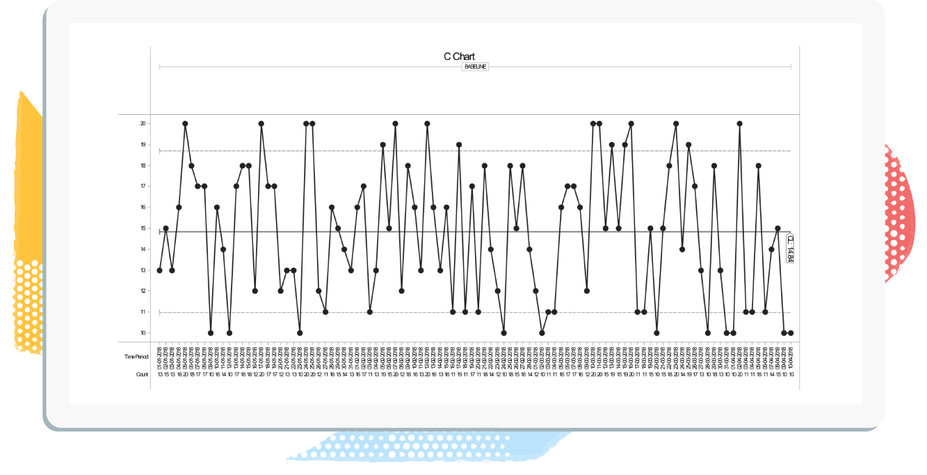
So lets say the 'Aim' of the project was to:
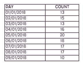
Reduce the number of patient falls by 60% in 12 mths on Ward B.
and the measure was:
Number of patient falls on Ward B.

You would need to capture the following data:

 
Time Period

Dates when the value was recorded

(Daily, Weekly, Monthly)

Count

The number of people that hit that criteria (Patient falls each day)


Sample size doesn't need recording as it should be the same each day


Data Capture Example:

Number of patient falls on Ward B each day

C Chat Data Example 2


C Control Chart Example:
Number of patient falls on Ward B each day

C chart-1


If you want to learn more about SPC then take a look at our


Start improving with Life QI today

Full access to all Life QI features and a support team excited to help you. Quality improvement has never been easier.

Free 30 day trial