
Start improving with Life QI today
Full access to all Life QI features and a support team excited to help you. Quality improvement has never been easier.

Organisation already using Life QI?
Sign-up

Typical instances in healthcare would be:
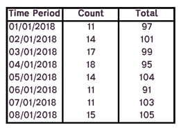
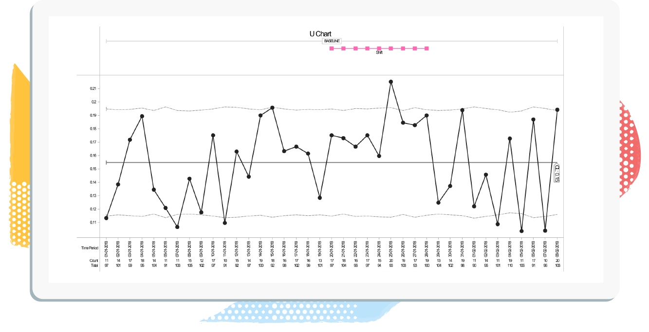
Here we will show you what data is required when creating a U Chart and how this is reflected in the Chart itself.
So lets say the 'Aim' of the project was to:
and the measure was:
| Time Period | Dates when the value was recorded (Daily, Weekly, monthly). |
| Count | The counts recorded at every time period (The number of patients that have slipped / tripped whilst in hospital, each week). |
| Total | Sample size each time the count was taken |
Data Capture Example:
Total number of slips and trips per week
Full access to all Life QI features and a support team excited to help you. Quality improvement has never been easier.
Organisation already using Life QI?
Sign-up