
Start improving with Life QI today
Full access to all Life QI features and a support team excited to help you. Quality improvement has never been easier.

Organisation already using Life QI?
Sign-up

We’ve had a really good look at Statistical Process Control (SPC) in this series of blogs – and we’ve also dived into SPC or control charts in some detail. In this blog we’re going to look specifically at the control limits that are used within SPC charts. We'll see what they are, how they are used and what they can tell us about the processes we are measuring.
Before we take a look at control limits, let’s just briefly ourselves about SPC as a methodology. NHS England and NHS Improvement advise that SPC should be used throughout a QI project ‘to help you identify a project, get a baseline and evaluate how you are currently operating. SPC will also help you to assess whether your project has made a sustainable difference.’
Whereas the function of an SPC or control chart is a ‘decision-making tool that provide information for timely decisions concerning recently produced products’ SPC charts help you to monitor and review the progress of QI projects, and analyse trends and variation. They are used to specifically plot more details, you can tell a lot about a process from a control chart.
Let’s take a look at the definition of control limits:
Control limits in SPC charts are extremely useful for many reasons. To put it simply and in the words of the IHI, control limits are: ‘like traffic lanes that help you determine if your process is stable and predictable or not. If a process is not predictable, it cannot be improved.’
Control limits help guide you in your process – as they are based on process measures and on the data itself. They act as a ‘realistic guideline as to what to expect from the process’
Control limits help you to judge the stability of a process in your QI programme. They take variation into account, which means they can establish the predictable limits of variation for the process measure. They will help you to detect signals and help you to understand if the process is stable / predictable or of out of control / not predictable. When the process is stable, control limits provide a frame for common cause variation.
Control limits help identify any special cause variation. In this IHI video, the narrator says: ‘The tighter the variation, the tighter the control limits; the wider the variation, the further apart these are. You do not dictate or determine the upper and lower control limits. The variation that lives in the data determines how wide or narrow these lines are.’
Control limits mean that you do not waste time in your QI project looking for unnecessary issues. The goal of any process improvement practitioner should be to only take action when warranted.
Control charts use control limits to help identify when a process has significantly changed or to isolate an unusual event. Because control limits are derived from data, you can’t know what the limits are until after you’ve collected a representative series of data.
A control chart always has the following type of lines, which are determined from historical data.
A Central line or CL – which is the average; ‘a Horizontal graphical line designating the mean or median of process measurements.’
An Upper line or UCL – which is the upper control limit; This ‘appears as a horizontal dashed line above the process average. Generally considered to be three time the standard deviation of the process measurements.’
A Lower line or LCL – which is lower control limit. ‘This appears as a horizontal dashed line below the process average. Generally considered to be three times the standard deviation of the process measurements.’
Take a look at our diagram here to help you visualise control limits:
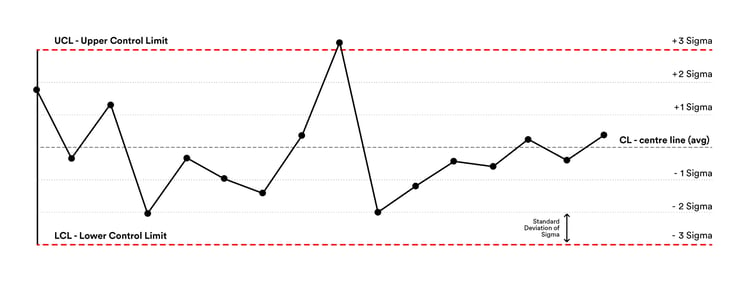
Figure 1: Control limits on an SPC chart (Source)
Control limits are calculated thus: your central line or CL is the average of your data set. You then calculate the deviation and add 3 deviations (sigma) above and below the CL.
+ 3 sigma = Upper Control Limit (UCL)
- 3 sigma = Lower Control Limit (LCL)
Control limits are initially set during the ‘Baseline’ period. This is the first stage of your data collection and management process, the next phases being Test and Sustain. Your control limits can be fixed once you are ready to move into the Test phase, where you can project them forwards. This will allow you to compare test results with baseline data. It’s worth noting, however, that while you can do this when you have three points or more on your baseline, it is strongly advised that there are 15 or more.
However, it’s important to note that control limits should be updated when a process improvement has been verified. This is where when adding data using QI software such as Life QI will save users a lot of time and effort.
Using Life QI, you will be able to easily use control limits as control limits are re-calculated automatically as each data point is added. For example, even though control limits are set during the ‘Baseline’ period, control limits can be recalculated if you notice a significant change to the system. You can read more here.
We hope you’ve enjoyed our series of articles about Statistical Process Control or SPC charts and this piece focussing on control limits. SPC can be such a valuable methodology within your QI project, and although they can seem daunting to start with, SPC or control charts are a valuable tool in your QI toolbox which can help you enhance your processes and your QI journey.
Full access to all Life QI features and a support team excited to help you. Quality improvement has never been easier.
Organisation already using Life QI?
Sign-up