Start improving with Life QI today
Full access to all Life QI features and a support team excited to help you. Quality improvement has never been easier.

Organisation already using Life QI?
Sign-up

In this series of blogs we’re going to take a closer look at Statistical Process Control or SPC – something that you may well have encountered in your Quality Improvement (QI) journey thus far. In this article we are going to drill down into SPC or control charts and how you might go about interpreting them. You probably know that measurement is a key element of a successful QI project, so let’s find out how SPC charts can help.
Statistical Process Control or SPC is defined as: ‘the scientific, analytical methodology used in industries such as healthcare and manufacturing to control quality, record data and monitor a process over time’.
Also described by the Institute for Healthcare Improvement (IHI) as ‘a branch of statistics that combines rigorous time series analysis methods with graphical presentation of data’, this methodology is often used to support QI projects. It was Dr. Walter Shewhart who introduced the concept of Statistical Process Control and it is now used across the globe to reduce process variation and improve quality.
In this article we are looking specifically at SPC or control charts - a popular tool which will help you to record your QI project and evaluate data – either at a small scale or across your organisation.
East London NHS Foundation Trust’s QI team describe the SPC chart as a: ‘statistical tool used to distinguish between variation in a measure due to common causes and special causes.’ They help you to distinguish between types of process variation and helps the user to identify when there is an unusual event. ‘Control charts build upon periodic inspections by plotting the process outputs and monitoring the process for special cause variation or trends. Control charts are decision-making tools that provide information for timely decisions concerning recently produced products’. Essentially, a control chart uses data plotted in time order to demonstrate how a process changes over time.
SPC charts are extremely detailed and require time and effort to prepare, but they will support you in your QI decision-making – making your decisions more data-driven and easier to understand.
Let’s take a look in more detail about what to expect in an SPC chart.
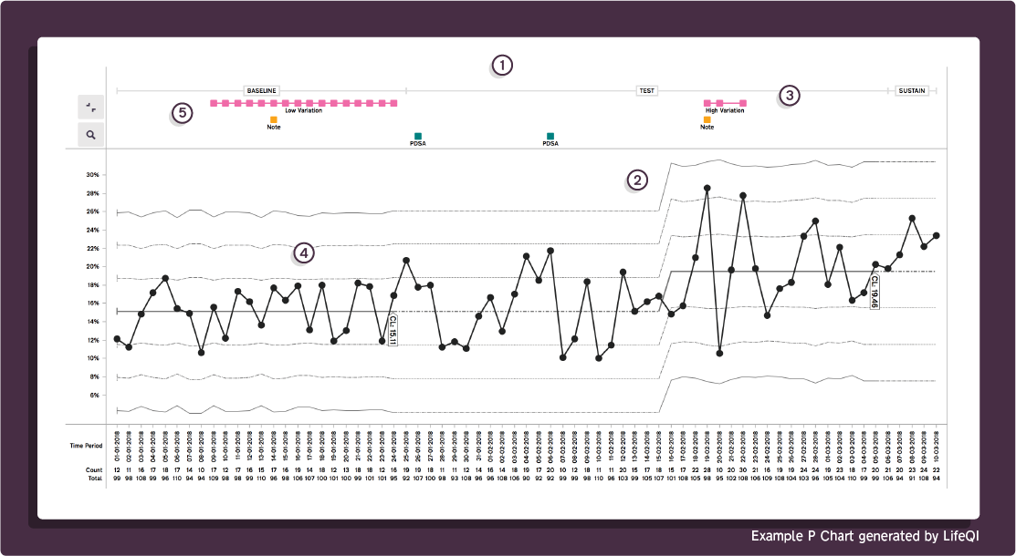
Figure 1: Statistical Process Control (SPC) charts in Life QI
If you have never encountered an SPC chart before – you could be forgiven for being slightly daunted on first sight! However, it’s worth holding your nerve, as the outcome of using an SPC chart can be so beneficial to your QI project.
An SPC chart uses data plotted in time order to demonstrate how a process changes over time. Before you start planning, and before you start your chart, you need to do the following:
Let’s take a look at the phases required for an SPC chart.
Baseline phase - this is when you collect data which you will use as a basis for comparison to determine what the process is doing.
Test phase - data that you collect during the testing of changes to find out if the changes are having a statistically positive effect.
Sustain phase - this is when you continue to collect and measure data to ensure any improvements in the test stage are sustained.
Control charts can play a key part in your QI project – but they can be complicated. It’s also really important that you start monitoring your QI process using SPC before you implement any changes.
Here’s what to expect in an SPC chart:
All data is plotted on a graph with pre-determined control limits. An SPC chart has a center line and two control lines above and below the center line, both of which allow more statistical interpretation. These ‘are determined from historical data. By comparing current data to these lines, you can draw conclusions about whether the process variation is consistent (in control) or is unpredictable (out of control, affected by special causes of variation).’
One of the ways you can interpret a control chart is by placing zones on it. We’ll look at this in more detail in later articles.
A control chart has two axes as follows:
‘The X axis you have data in chronological order e.g. months of the year
On the Y axis you have the measure of interest e.g. %, count’
An SPC chart generally needs around needs around 15 data points – although preferably 20. These are discrete units of information derived from a measurement, usually represented numerically and/or graphically.
This is ‘usually the mathematical average of the samples plotted — upper and lower statistical control limits that define the constraints of common cause variation and performance data plotted over time.’
‘Once the data points are connected you put a centre line (CL) between the graph. For a control chart the CL is called the mean.’
‘Control charts also contain control limits which define the boundaries of expected common cause (random) variation around the mean.
LCL (Lower Control Limits) appears as a horizontal dashed line below the process average.
UCL (Upper Control Limits) appears as a horizontal dashed line above the process average.
These are often known as sigma limits’
If you want to read more, ELFT have a really good explanation for the reading a control chart. While the NHS England and Improvement's 'Statistical Process Control' talks you through how SPC charts are structured.
Later on in this series of articles, we’ll be talking more about special and simple cause variation … let’s take a quick look now:
‘Variation that is expected and natural in the system. Whilst this doesn't indicate that the system is working well, it does mean that the system is stable and predictable.
This can be defined as variation that is unexpected and not a consistent part of the process. These causes are often infrequent but can result in a chaotic problem. The cause could possibly be a defect in the system or a problem that has never happened before.’
If you want to find out more about SPC charts – and which type of SPC charts to pick in your QI journey, take a look at our blog: ‘Picking the Right SPC chart every time’. We also share with you a 'SPC Chart Type' infographic guiding you through the decision-making process.
We’ve had a good look at SPC charts and will be exploring further in this series of articles. While they are complex, if you are using a software such as Life QI, the whole process becomes much easier. Life QI has SPC charting functionality, so you can easily visualise and analyse your data with confidence.
If you are still feeling like you need a bit more information – why not watch one of our SPC webinars?
Full access to all Life QI features and a support team excited to help you. Quality improvement has never been easier.
Organisation already using Life QI?
Sign-up