
Start improving with Life QI today
Full access to all Life QI features and a support team excited to help you. Quality improvement has never been easier.

Organisation already using Life QI?
Sign-up

Choosing the right SPC chart is a critical part of any improvement project because it allows organisations to effectively monitor and control their processes. A well-chosen SPC chart helps in identifying process variations, detecting abnormalities, and making informed decisions to improve quality and achieve desired outcomes. On the other hand, if you pick the wrong chart, the control limits will not be correct for your data.
You should consider several factors when selecting an SPC chart, including the type of data (continuous or discrete), sample size and frequency, distribution of data, specific process characteristics, and stability of the process. Evaluating these factors helps you choose the right SPC chart for an accurate analysis of your improvement work.
To determine the suitable SPC chart for your improvement project, it is essential to follow a step-by-step approach. This involves defining your project goals and objectives, collecting and analysing data, identifying process characteristics and variables, and then selecting the right SPC chart based on the nature of your data and process.
In this article we guide you through the process and explain each step one by one. Ready? Let’s get started!
When it comes to SPC charts, there's a variety to choose from, each suited for different purposes. Here are a few popular ones:
Similar to the X-Bar R chart, the X-Bar S chart also monitors the average process performance (X-Bar) but uses the standard deviation (S) as an indicator of variation. It's especially useful when the sample size is relatively small.
The Individual and Moving Range (I-MR) chart is perfect for situations where you can only measure one observation at a time. It helps you track individual measurements and their moving ranges.
The P chart is your go-to option when you're dealing with discrete data or count data. It helps monitor the proportion of defective items or events in your process.
The C chart is all about counting defects or nonconformities in fixed-size samples. It's like the detective of SPC charts, ensuring that you catch every sneaky defect that comes your way.
When the sample size you're dealing with varies, the U chart steps in. It monitors the average count of defects per unit, allowing you to keep track of process performance.
When the error or undesired incident occurs infrequently in a particularly setting, the use of a T chart is most indicated. Each point on the chart represents an amount of time that has passed since a prior occurrence of a rare event.
When the error or undesired incident occurs infrequently in a particularly setting, G chart is used to count the number of events between rarely-occurring errors or nonconforming incidents.
Choosing the right SPC chart for your improvement project is like finding the perfect match. We have a useful infographic which helps you with the decision, but let’s take a closer look at each step one by one.
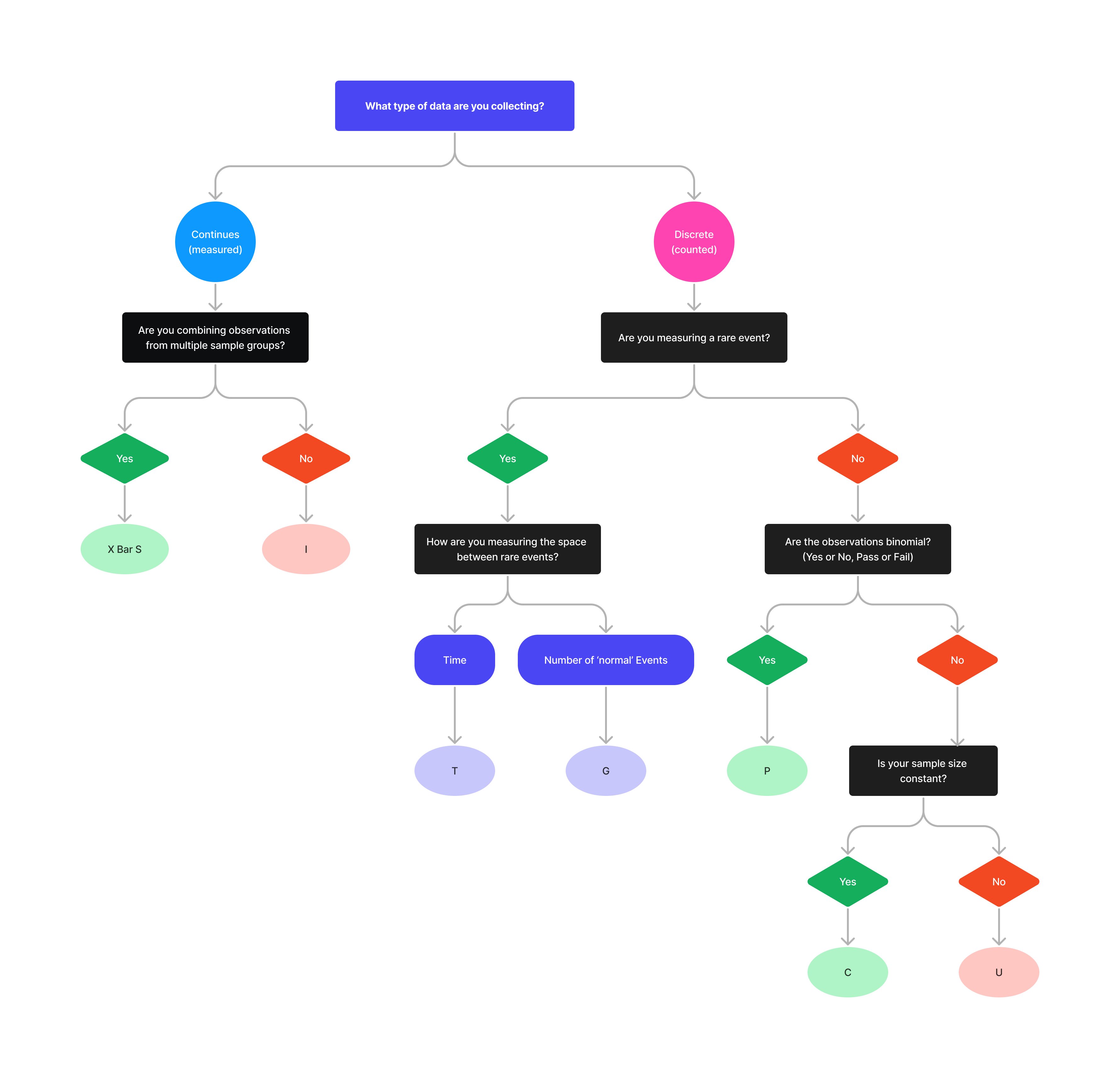
Different SPC charts are designed for different data types to ensure accurate monitoring. So first, you have to determine the nature of your data: is it continuous (measured on a scale) or discrete (counted occurrences)?
Continuous data can take any value (within a range). For example, measuring the weight of each person. This data can be recorded at many different points.
On the other hand, discrete data can only take certain values, so it's pretty black or white. For example, the number of people in the department, you are counting whole, indivisible entities! You can't have 3.5 people!
Consider the sample size you're working with and how frequently you're taking measurements. Some SPC charts are more suitable for large sample sizes, while others work better with smaller ones. The frequency of measurement also affects which chart is the right fit for your project.
Are you combining observations from multiple sample groups during the same period? An example of this would be running the same test, in multiple departments on the same day.
Also, how frequent are your measurements? Are you working with rare data? Conventional charts exhibit problems with rare events due to the infrequency of the data recorded. An example could be number of errors or accidents. Let's face it nobody decides when an accident is going to happen, it is just a rare occurrence that should absolutely be recorded.
Based on how you measure data between 2 rare events, the right chart type varies. You can measure it either by time (E.g. days, weeks, months in between rare events) or by number of 'Normal' events (e.g. recording the number of admissions between infections (Infections being the rare event) on a ward).
Take a peek at the distribution of your data. Is it normally distributed or skewed? Some SPC charts assume normal distribution, while others can handle different distributions. Choose a chart that aligns with the characteristics of your data.
Consider the unique aspects of your process. Is it a one-measurement-at-a-time scenario or a fixed-size sample situation? Are the observations binomial (meaning that the results will only have two possible outcomes: Yes/No, Female/Male, Pass/Fail)?
Understanding the characteristics of your process will help you select the most appropriate SPC chart.
Last but not least, assess the stability of your process. If your process is stable and predictable, specific SPC charts might be more suitable. But if your process is unpredictable and prone to special causes, other charts might be a better fit.
Remember, choosing the right SPC chart make or break the successful measurement of your improvement project. Take these factors into account, and you'll be well on your way to success.
First things first, before you dive into Statistical Process Control (SPC) charts, it's important to clearly define your project goals and objectives. Are you trying to reduce defects, improve efficiency, or optimize a specific process? Understanding what you want to achieve will help you guide through the chart selection process.
Now it's time to roll up your sleeves and get down to the nitty-gritty of data collection and analysis. Gather relevant data that represents the process you're monitoring. This could be measurements, counts, or even categorical data. Once you have your data in hand, analyse it to understand its characteristics and patterns.
To choose the right SPC chart, you need to identify the key process characteristics and variables that you want to monitor and control. Is it the mean, variation, or both? Are there any special causes or factors that can affect the process? Consider these factors carefully to ensure you select an appropriate SPC chart.
Now that you have a clear understanding of your project goals, analysed your data, and identified the process characteristics, it's time to choose the right SPC chart. Select the one that aligns with your data and process requirements.
It’s important to find the sweet spot between overcomplicating and oversimplifying! Selecting the right SPC chart can be a delicate balance. Don't go overboard with complex charts if a simpler one will serve your purpose, but also don't oversimplify and miss out on valuable insights.
Data comes in all shapes and sizes. Each type of data requires a different SPC chart to fully understand and monitor it. Continuous data, discrete data, proportions - they all have their unique charts. So, don’t treat them in the same way. Always choose the most appropriate chart based on your data.
Ignoring process variation and stability can lead to incorrect chart selection or misleading results. Make sure your process is in a state of control before measuring it with an SPC chart.
SPC charts can be like a foreign language, especially when for beginners. Misinterpreting the signals and trends can lead to wrong decisions and wasted effort. Take the time to learn how to correctly interpret and use the charts. Don't be the person who confuses a spike in the chart with the success of the whole improvement project.
We appreciate this is a lot of information to take on board, hence the infographic! We hope this gives you a better understanding of Statistical Process Control (SPC) chart types, but if you are still sat there wondering, get in touch with our team at Life QI.
Full access to all Life QI features and a support team excited to help you. Quality improvement has never been easier.
Organisation already using Life QI?
Sign-up